Progress Photos
Final Piece

Artist Statement
The identity collage took a lot of time and effort but it made me reflect on myself more as a person because I tend to have a different perspective of myself than others do. This project helped me in being able to appreciate the little aspects of yourself and why you are the way you are.
I first started with my background and I incorporated all different designs from magazines. For example, I cut out objects that included polka dots, stripes, etc. Most of those pieces were colorful also which represent a vibrant, outgoing feeling. I then found words throughout the magazines, that I used to describe myself as a person and cut those out individually and placed on my background. I then started to place and shape out my hair. I used mostly all dark brown pieces and then added some lighter brown pieces to give the collage more of a real look. This lead to me to placing my skin pieces down. I used darker skin pieces along the outer edges of my skin to display the shadowed look and I stuck to lighter skin in the middle except for my nose. But I also used some more darker skin pieces to outline my nose. I finished up with all parts of my eyes and then my smile. I mainly approached the neck in the same way where I used darker pieces right under my face to represent the shadow and then continued downward with lighter pieces of skin. Where I completed the identity collage with a black shirt so that it would not clash with my background.
I personally think that portraits can change your perception of others because it gives you a chance to really admire the little details in people and to see what makes them unique. I also think that by creating a self portrait can mean that you are influencing how others see you because you may display the portrait as how you see yourself which could be totally different from others and that is how you want other individuals to see you as well.
The Real Anatomy of Technology
Progress Photos
Final Piece

Artist Statement
In the real anatomy of technology project we were asked to take a piece of technology and an organ of the human body and combine the two together in some sort of way. The process of this project was challenging yet satisfying. I started this piece in a confused way not knowing what I would do but as it came together I was very pleased. The piece allowed me to express my thoughts and feelings of life in a way I had not really thought about very much.
With this art piece I decided to take the human heart and incorporate a Polaroid camera with that organ. Like any human heart there are veins and I displayed those as a way to bring the two objects together. As throughout the heart there are many veins but one set wraps around the Polaroid camera as a way of showing our heart has a hold on the camera which means to me a way in representing our lives. People often say to enjoy the moment and no picture can live up to the actual time but in my mind I see capturing moments is simply a way in helping us to reflect and bring us happiness from the good times in our lives. There is also a set of veins which represents the strap of the camera. Whereas this also goes to represent how cameras can help us to capture many of our greatest memories in our lives but this set of veins expresses something more than just that. While using the strap of the camera does not always mean we are using the camera it also communicates that we can set aside our memories, the good and the bad, while we continue to make more of those but always be able to come back to those and learn both good and bad lessons from them. This piece really offered me the opportunity to think in a way I would not have normally and I found enjoyment and interest in that.
One more thing that I included in this project was actual Polaroid pictures to balance out the piece and to also show different things that meant something to me. Each picture has something different in it that either is important to me or something that I like. As I take a step back and look at the finished product, I am glad I did this project the way I did and how it allowed me to think about life in a way I usually would not.
The Value of Words
Progress Photos
Final Piece
Artist Statement
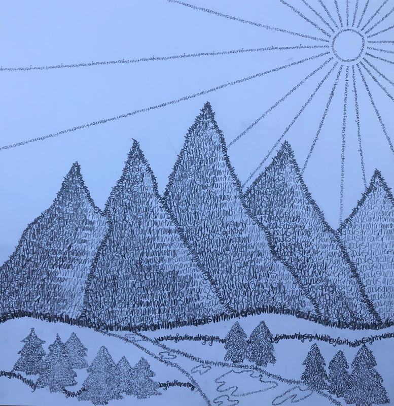
For the value of words project we were asked to design a picture out of all words. The words were to mean something relating to the picture or to yourself. The picture that I chose to create was the mountains where the sun is shining down with a stream of water running throughout. Also, there are trees surrounding the area and rollings are in the background. I enjoyed this project because it was cool to see how the picture came together as you went while using words. Also, the difference that the words bring to the pictures instead of just drawing it.
The main reason I chose this type of picture to create was because of where I was born. I was born in Grand Junction Colorado while I also lived in Denver as well. Colorado is known for their mountains which are the Rockies. This state will always have a place in my heart and I will forever remember it. I also love the view there and the peacefulness it brings. The other reason that I chose this type of picture to draw was because I feel as if mountains and this kind of scenery brings a sense of adventure and beauty in the world. I hope to adventure out into the world and not only see but discover many things. But I believe without our amazing god, none of that would even be possible.
As believing in everything is possible with our god, my faith is very strong. This is the reason why I chose the words, quotes, and bible verses to create my piece. I used quotes like “God is within her, she will not fall”, “God is greater than the highs and lows”, “ When you pass through the waters, I will be with you”, while there are also other ones. I believe that these are all very important in getting through the good and bad times and you should be reminded of these things everyday. While I was applying these words, I also made sure to define between the dark and light parts of this piece. The base of this piece such as the hill the mountains are on are darker to show they hold a place for other objects and I applied a dark to light contrast on the mountains moving from left to right to show how the light is reflected on them. While I worked on this piece and finished it, I realized how it helped me to understand words do have a lot of value and can mean many things, the good and the bad.
Printmaking
Final Piece
Artist Statement
The printmaking project consisted of taking a block which had a structure between an eraser and butter. We were to stencil on a picture of our choosing and then to carve it out. Either carving an outline of the picture or to actually carve out the objects itself displaying a different type of picture. There was two kind of carving tools, one to make smaller lines and one to make bigger lines.
For this project I decided to stencil out a flower which started in the bottom corner of the block and then the petals of the flower dispersed throughout the rest of the block. I chose the flower because I have always enjoyed drawing different kinds of flowers so I thought that it would be interesting to see what a flower would turn out like if it was carved. Also, I personally believe that flowers stand for a type of beauty because there are so many different types but they are also alike because they mainly consist of the same general parts.
I chose to carve an outline of the flowers out to display a simple but elegant picture. The carving tool that I used to create the picture was the smaller tool because of how many petals there were. I started out with the center of the flower where I experienced this was tougher than the rest of the flower because of the circular motion. I then to moved onto the petals and after I did the general outline I made more detail to some of the petals by carving out 2 lines next to each other inside the petal. One more obstacle that I had a slight problem with was carving right to the edge because it left a little bump on the end but otherwise the carving was a lot easier than I expected.
When I was done with the carving I tested the actual print of the picture. With this I took ink and rolled it out onto a sheet of paper with the brayer and rolled the brayer onto my block making sure there was enough ink to print a solid picture. The printing took a lot of trial and error but
I did not have to make any changes to my print except for adding more ink to my block when I wanted to print. The result of the prints was having 4 final ones that you liked. I printed onto white paper and a lighter mauve color.
The final thing that I did was measuring and cutting out my prints to line them with a border and then to make cards out of those prints. The colors that I chose for my borders were a deeper olive green color and the lighter mauve. I then measure white card stock paper and folded it like a card and applied my bordered prints to them. Finally, I took pictures of those for my website and will update that with those pictures.
I had never done printmaking so it was interested to learn about it as I went. I really enjoyed carving the picture part and it was a lot easier than I anticipated. I would definitely do this project again and I think it would be really fascinating to print make on a larger block as well and add more to the picture being displayed.
Automatic Drawing


Artist Statement
The automatic drawing segment that we worked on in class was a very different style of art considering that a person does not plan what they are going to do or how they are going to do it but instead they just go for it. I actually learned quite a bit from this lesson because it made me step out of my comfort zone and to jump right in to the art itself.
We were instructed to get an assortment of charcoal and chalk and then to just “go for it” in making a piece. I felt pressured because I normally spend a decent amount of time planning my projects. I usually decide what I am going to do and how I am going to go about it but this time was so different. I just started drawing random lines. I did not like the fact that I had no idea what was going to come from the work I was doing and how I was going to turn it into something that actually made sense to the human eye.
As I continued working on my piece, I ran into obstacles like where was I going with it and how would I make it into something. I then kept going and started adding color to my project where I also made new and different lines than I had before. This is when I started to notice that my piece was actually going somewhere. I created lines on the side going up and then as they got higher they had dispersed out from each other. From this I saw a type of plant, weed, or a type of wild flower. Then I added colors to display water, at the bottom and top as a lake or pond and as the sky. I then had lines shooting up and out from the water and into different directions where I thought they could be splashes of water or possibly fish. It was very interesting to see how the project came together and how I had to trust the process.
While I was skeptical about the whole project to begin with, I did indeed learn to trust the process as I went on and I learned lessons from this type of art. One lesson was that everyone should learn to just let go every once in a while and freely express themselves and to take a break from the planning and the stress that comes with that. This can benefit people greatly. Also, I learned that this type of artwork can help a person in expressing how they are feeling and to understand how that is affecting them. Automatic drawing allows a person to just freely express themselves without thinking about anything. While not thinking about the art before you do it, lets your body reveal your actual emotions and well-being instead of just assuming that you are doing okay and that everyone else is too.
Sculpture Invitational
Final Piece

Artist Statement
Call to Sculptors
Applicant’s Name: Jenna Zaeska
Hometown: Atwater, Minnesota
Title of Sculpture: Tadd Lake Bobber
Type of Sculpture: Realistic
Your Sculptures Theme: Atwater as a whole
Materials used in your maquette: Clay and Glaze
Materials and construction techniques proposed for the large public version: How will the finished sculpture be fabricated? I would use metal and or wood. I would have the public version carefully measured out and assembled. The sculpture would then be painted red and white with a blue base to represent the water.
Author Narrative:
The maquette is a small sculpture designed for specific place like a community. The piece could be made bigger and represent the community in a certain way. The artwork starts off small in case of changes that need to be made.
The piece that I chose to sculpt for this project was a fishing bobber. I live in the town of Atwater and a fishing bobber represents our town. The design can be found in many different places. For example, on the signs which say Atwater as soon as you are entering the town. Our town is mainly represented by this certain symbol because our town has its own “lake” which is Tadd Lake. The water does not amount to very much but it still is a part of us. I believe that the town you live in for most of your life becomes a very special place in your life and it is important to remember it. Also, to remember all of the memories the town gave to you.
As I was making my piece, I ran into a few obstacles such as how to hollow out my bobber and to form a good looking circle. I learned to keep working with the clay and forming it as I went. I also learned to set my sculpture down from time to time in order to see the details I needed to fix. I did not want my bobber to look like it was just randomly sitting there so I formed a base for it. After the pieces were fired, we finished them up. I chose to work with glaze on my bobber. I painted the bottom half red and the top half white. The hook piece on top was red with some black. I then decided to paint my base blue to represent the water that it would float on. I then finished it off by writing atwater on the bobber with a black fine point sharpie.
My maquette could enhance the community by displaying the bobber somewhere near the body of water in our town. The bobber could act as memorabilia for the town and people could reflect back on the sculpture as remembering the town.
Art for Change, Art for Awareness

Artist Statement
The social justice issue project contains an enormous amount of meaning and importance. The project gave me an opportunity to really reflect on the bigger issues in our world and how they are affecting us today and how they will continue to in the long run.
The issue that I chose to address is that technology is indeed taking over our world. We may not realize it or are far too engaged in technology ourselves to clearly understand the problem. Of course technology is a huge advancement in today’s world but we are often finding ourselves too caught up in the negative parts of it. Especially being a teenager myself, I want to understand the situation and fix it at least for myself before it becomes too late.
The piece that I chose to do for the final project was a city that is at the beginning of being destroyed by this “monster” and this monster is simply technology. The “monster” is represented by a computer. I lined a majority of the page with different skyscrapers and some were regular ones you would typically see and some were not. A group of buildings are shown in the midst of being pushed over. The “monster” stands tall overlooking all of the skyscrapers and is in the process of destroying our world.
The color schemes that I chose also have a great deal of meaning. The buildings that are untouched and stand tall are in bright colors like pinks and reds, as if there is still good in this world. The buildings in which are falling over are a dark color pattern such as black, gray, and brown as well as the “monster” being a black. The black shows that technology is doing a lot of harm to the people in our world. The clouds displayed in the sky are a gray and almost look as if they are clouds of lingering smoke to represent technology closing in on us and we have to do something before there is nothing else that we can do. While the clouds in the sky are gray, the sky is a dark blend of colors such as blues, purples, and black. One last major part of the drawing is that the computer screen says “intelligent is at fault” which means what we have as people and our gaining is in danger because of how we are abusing it with technology.
I found this piece to have a very strong message and I believe that this situation should be took into more consideration than it has. I understand that technology has been a key part in life today but we may be tricked as to what this tool should actually be used for. As life goes on I hope to see people find more meaning to life than what the world has to share online.
